Today, we are surrounded by new technologies and digitalization. A comfortable life would be impossible without smartphones, tablets, or laptops. We rely on our pocket screens for everyday activities such as communication, work, education, and shopping. Because of this, many experts have referred to today’s world as mobile-centric or mobile-first.
More than 3.5 billion smartphones are currently in use around the world, according to Techjury. Approximately 79% of mobile phone users purchase goods and services through their pocket screens, according to OuterBox research.
The widespread use of mobile devices has revolutionized the business world.
The result is that businesses are forced to build mobile applications, as well as marketing strategies that are focused on mobile-driven leads and sales.
Among the most popular win-win strategies of today is a mobile-first approach. When pocket screens access content primarily from the internet, it meets the needs of modern society. Companies are increasingly prioritizing mobile experiences by reshaping the way they interact with their end-users and even the way they approach digital marketing.
Where do you see the end goal?
Increased engagement online and improved the efficiency of digital advertising campaigns (higher return-on-ad-spends / ROAS).
What is a mobile-first strategy?
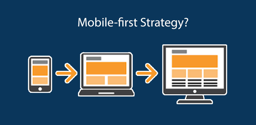
The term was popularized by Luke Wroblewski’s book “Mobile First.” In the book, Wroblewski outlines the common problems companies faced when transitioning to mobile web from desktop. A mobile-first approach means shaping your business with mobile customers in mind. An optimized mobile-first strategy prioritizes your business’ mobile app and mobile web capabilities over desktop capabilities. Daniel Newman, the Principal Analyst and Founding Partner of Futurum Research writes, “To be mobile-first, companies must focus on creating user experiences that are equally effective on mobile devices. We need to create mobile user experiences that convert, then the rest of the devices will follow.” He also said, “Mobility can help break down other silos within your business, bringing an end to self-limiting technologies and behaviors that your digital transformation should eliminate.”
How does the mobile-first approach benefit companies?

The increase of mobile users and mobile web usage is driving businesses to adopt mobile-first strategies: 78% of teens use smartphones instead of laptops, and almost 70% of all media is accessed via mobile. As a result of personalization, mobile apps can also help you create a strong relationship with your customers. Three-quarters of users want more customized apps and websites, and six seconds of customers say they want personal emails based on their purchase history.
• Users can get more features and options which will improve their experience and lead to more conversions and leads.
• The UX is more detailed and rich user data is provided (based on clicks and scrolls). It also tracks user locations for marketing and analytical purposes.
• Provides customized advertising strategies and mobile-centric marketing campaigns for reaching the market.
• Gives users the option to choose between a mobile-friendly and a desktop-friendly version of the site, whereas the mobile-friendly site will provide a broad range of services and functions compared to the budget-friendly desktop landing with links to a mobile app or site.
Responsive web design vs. mobile-first: What’s the difference?

Your desktop websites need to be redesigned to be compatible with mobile devices as part of responsive web design. For your desktop version to work on such a smaller screen, you and your design team need to scale down and simplify it. This approach puts the desktop version first, as opposed to a mobile-first strategy.
Let’s explore the advantages of mobile-first development within the context of business and marketing, along with the negative consequences of not having a mobile-friendly website.
A mobile-first strategy has several advantages
Consumer-centric businesses generate more revenue and outperform their competitors. The growth of smartphone users and hearty fans of web searches on pocket screens makes a mobile-first strategy the most effective way to attract more clients and exceed customer expectations. As well as some other benefits, one of the biggest is the expansion of the audience.
The following are some benefits of having a mobile-first strategy:
1 – Expanding the Audience

Globally, about half of the web traffic comes from mobile devices, according to Statista. 54.8% of the website traffic generated for the first quarter of 2021 was generated through pocket screens.
Compared to 2015, this represents about 5% more growth than in 2020. Therefore, it is expected that smartphone owners and those conducting web searches and browsing on the Internet through their mobile devices will increase even more.
Reaching new customers is possible with a mobile-first strategy. Now is the time to become mobile-friendly if you want to open up new markets and create new revenue channels. YouTube’s expansion of its audience is an excellent example of mobile strategy.
This video platform’s design is far from responsive. The platform is designed for mobile devices. Desktop and mobile versions of the platform are separate. On mobile devices, there are no buttons or text displays. Just a short time ago, there was a night mode. Pocket screens may offer small-screen touch but only based on the habits of the user.
In addition to gaining new viewers, YouTube’s mobile-first strategy brought bigger revenues from advertising contracts with brands. Mobile traffic makes up about 40.9% of YouTube traffic. In 2020, younger users (15-25) dominated the market following the mobile-first strategy.
2 – Chances to Rank Higher

Digital marketers and entrepreneurs have been forced to adapt quickly to mobile-first strategies since Google’s mobile-index update earlier this year. Due to this, Google gives greater weight to mobile-friendly websites in its search results. Consequently, mobile-first development promotes higher rankings for online businesses.
As the most widely used search engine, Google is the most convenient tool for marketers to track mobile-friendliness statistics and insights. Monitoring and analyzing these parameters regularly is recommended, particularly in the context of the local presence (country of business on the website/app).
Ranking factors such as page load time are important. The Creative Momentum research suggests that mobile-first websites should be more keyword-rich and limit their content. The page load time will be sped up and conversions will be increased since a delay of 1 second will result in a 7 percent drop in conversion rates.
You should keep an eye on changes in organic search results for your website, as well as Google ranking, and make sure that your mobile version is consistent with the desktop version in accordance with the requirements of a search engine and its algorithms. In addition, Google offers users a mobile-friendly test that lets them enter a URL and look up its status online.
According to the report, there are several factors that determine mobile-friendliness (scripts, slow page loading, Robots.txt blocks, etc.). Mobile-friendly websites with an effective SEO strategy are more likely to rank high.
3 – Easier Communication and Relationship Building
In a mobile-first approach, you can build stronger relationships with your customers through improved functionality and flexibility. Moreover, you can incorporate social media marketing hacks and chatbots.
A mobile-first approach to development brings a number of benefits to communication and interaction.
Also, your customers will appreciate the fact that you provide them with more channels for communication. Entrepreneurs will be able to communicate more effectively with the chatbot or standalone mobile app. Stronger relationships are built through more interaction with your target audience. Therefore, you get long-term customers and loyal clients.
Furthermore, your brand reputation and trustworthiness improve if you are able to facilitate easier communication and relationships. The Typeform mobile app is one great example. You can ask managers or chatbots any questions you want by selecting one of the buttons on the application’s main screen.
4 – Improving Customer Experience

In the context of UX and website performance, mobile-first solutions surpass expectations in all efficient digital solutions. Your company and brand can improve customer loyalty by meeting customers’ expectations. A mobile-friendly site or app presents a more comprehensive range of options to your target audience, creating a tailored user experience.
Within the context of mobile versions, UX-driven approaches include:
• Large, clear buttons on the menu;
• Not only on the homepage but also on the sidebar;
• Improved navigation and conversions with shorter forms;
• Tones, colors, and well-visible call-to-actions;
• Font sizes for content should be smaller;
• Fewer ads, but they’re more catchy.
Companies can focus on their tactics and methods. With its thumb buttons, the mobile version of the Pitchfork design improves UX considerably. Users can browse content more easily and navigate more efficiently.
5 – Leveraging Customer Data

With mobile-first development, marketing strategies and website performance are improved by gaining valuable insights about customers. As an example, you can promote the personalization of the mobile design using data-driven solutions such as location tracking. Your user experience will be improved, and your revenue will increase.
6 –Cost-Effective and Valuable
A mobile-first strategy is essential in today’s mobile age. Optimized experiences will only expand your opportunities to engage with people and grow your business by reaching more people and generating revenue. However, Mobile-first strategies are cost-effective in the long run, even if they require higher budgetary resources.
Following are some examples that illustrate the benefits of a mobile-first design –
YouTube

In 2017, YouTube introduced Material Design, which emphasizes that the desktop version is the subordinate of the mobile version. The goal of the button and text display on small-screen touch mobile devices is to adapt to the user’s habits. The new night mode also acknowledges the dominance of mobile devices. An attractive design feature: no button or text display when in night mode.
Apple

The content layout on the Apple mobile website is excellent. Thus, users do not have to use the navigation button and can simply scroll down the page to access information, which is very convenient and easy. A shopping bag icon is usually an essential part of a user’s first glance when they are shopping. You can also search for information in the bottom navigation if no information is desired after browsing the page. They have designed the page with convenient scrolling navigation.
Airbnb

The Card design makes it easier for information and users to connect for a limited period of time. Google chose the Card design for this reason. Some other Internet companies are starting to follow this trend. Cards have a concise, effective message and often include a title, picture, graphic, or profile text. The design provides users with enough information, so they can decide whether they want to learn more.
Non-mobile-friendly websites: Consequences
You may lose new leads when your website ignores mobile-centricity or responsive design rules. Pocket screens drive an enormous amount of traffic. The so-called m-dot websites and those that aren’t mobile-friendly turn away potential customers who are interested in interacting with digital products via smartphone or tablet.
Don’t let your online business fail because you don’t have a mobile-friendly site. Here are some consequences:
• Drop-in traffic – Your website will lose tons of traffic when users discover it isn’t properly optimized for mobile devices. If you don’t take advantage of the popularity of mobile browsing, searching, and shopping, you may lose customers. In addition, search engines penalize incompatible sites. Suddenly your chances of appearing in the top search results are extremely slim.
• A decrease in time spent on a website and increased bounce rate – disappointed website visitors leave non-mobile-friendly digital platforms very fast to look for a new one that meets their needs.
• Decreased conversion rate – If you only develop the desktop version of your website, you will likely lose leads that could be converted into customers. You can increase conversion rates and prevent revenue erosion by using responsive design or mobile-first development.
• Losing to your competitors – There are plenty of options available to Internet searchers. People who are searching for goods or services via pocket screens will bypass your non-mobile-friendly site in favor of one that offers an attractive interface and a more mobile-friendly experience.
Top Tips for a mobile-first website Approach

So, you’ve decided to go mobile-first? Now what?
• Websites must be mobile-friendly. It should go without saying, but mobile-friendly websites are easy to navigate for consumers on the go. You should be able to click buttons easily, read text easily, and have a perfect balance of copy and images.
• Make sure your page loads quickly. You should test the speed of your site before launching it. Your mobile users probably have even less patience or time to speed, so every second counts.
• Making it easy to provide feedback is crucial, both for your business and for the users of your website.
• The perfect touchscreen target: it’s harder to pinpoint something with a finger than it is with a mouse click. On mobile, 7-10mm touchscreen targets are ideal.
• Simple is best: mobile-first design has to be clear on small screens, so you might want to stick with a simple but effective identity.
Final Word
Mobile-first marketing should be the starting point for your digital transformation. Pocket screens are used by the majority of Internet users to communicate, place orders, and buy goods. Using the mobile-first strategy, businesses should conduct their business online today.
Mobile-friendliness can help improve business statistics (conversions, ROI, traffic growth, etc.) for many companies. Mobile-first marketing offers numerous benefits at once, so it’s a hot topic in 21st-century marketing.
A mobile-first approach is essential due to the growing number of smartphone users. Mobile-friendliness doesn’t only mean protecting your site from Google’s penalties. Game-based marketing, social media marketing, and engagement tactics are provided as new revenue channels and monetization strategies.
Get your mobile application built by experts by looking for a leading mobile app development company. You can work with them to not just develop your mobile product but also launch it and market it.
In the development of their website, Zestminds also follows a similar process. Smartphones represent a large portion of internet traffic without any signs that they will slow down, so opting to go mobile-first is a great way of meeting everyone’s browsing requirements. If you wish to discuss this, you can drop us an email at contact@zestminds.com, we shall surely get back to you.