According to recent studies, it is how much time people spend on their mobile phone’s apps per day. It’s a whopping 30% increase in the last two years, driven by technological advancements, a better grasp on UX and UI design, and, of course, the pandemic.
And that’s just the global average. In some countries, mobile users spend more than five hours every day on their apps!
App usage is increasing. The screen timer has expired. iPhone and other smartphone sales are increasing. The digital space is becoming increasingly competitive. With so many organizations vying for an audience’s full attention, creating the finest mobile app design possible is vital. The one who captures their attention, meets their wants, and, most importantly, keeps them returning for more. That is what we will discuss in this article
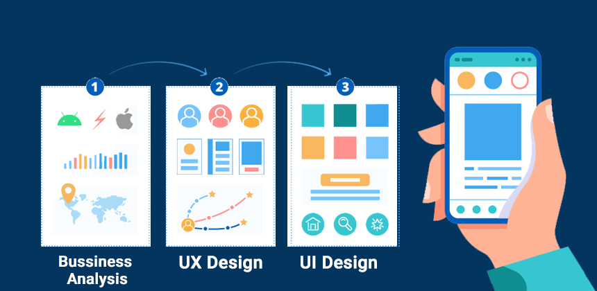
What is Mobile App UX Design?
Putting the customer first. That is, in a nutshell, what mobile app design user experience is all about. It stresses producing seamless, user-friendly, and intuitive experiences that align with what the target audience wants and how they want it, whether it’s a phone, tablet, or even a wearable device.
The finest mobile app design considers the app’s functionality. The appearance. The sensation. The need it meets in the life of the user.
As an example, consider the Twitter app. It, like other large IT businesses, provides a masterclass in app UX design (if we ignore the constant tinkering and updates that seem to annoy half the user-base, of course). Almost everyone, anywhere in the world – whomever they are, whatever device they’re using – can download and utilize the Twitter app effectively.
Let’s take a look at the finest mobile app design methods to help you perfect app design UX that truly delights your users.
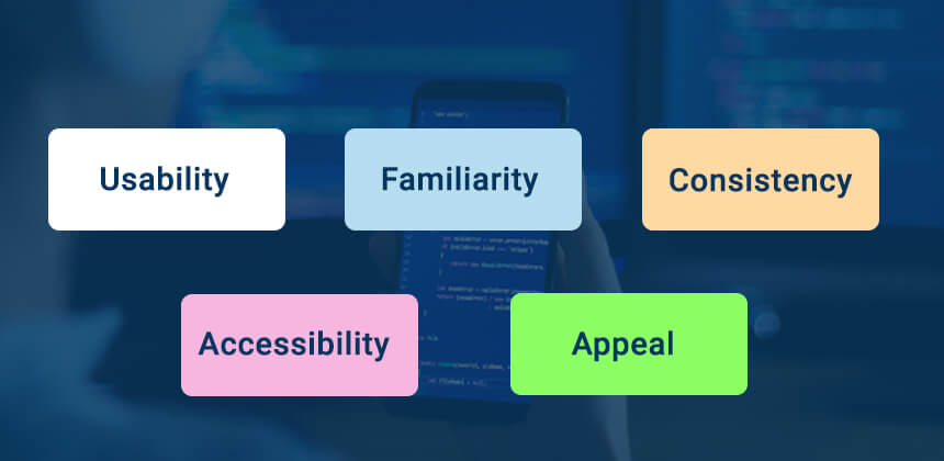
5 Principles of Mobile App Design
1. Usability
On a smartphone device, you have limited space. Don’t squander it. The Xs on pop-ups are too small or clutter the screen (making the whole app unusable – and a candidate for uninstallation). The trick is to strike a balance between what your users require and what you need to convey to assist them in achieving their goal.
2. Familiarity
Users prefer what they are familiar with. Whether people realize it or not, they will carry that over even if the design of an app changes in subsequent versions. Perhaps it’s muscle memory. Perhaps it’s just subconscious. The ‘search’ icon is a great example of this. We seek for it instinctively in the top-right corner of the screen. Because it can be found in practically every app and website. Use data to determine what works. From there, expand. There is no need to recreate the wheel if users are clearly familiar with the present design (you can just make it smarter).
3. Consistency
Consistency is essential for developing seamless user experiences. Design consistency involves ensuring that your application adheres to a single design philosophy throughout. For example, the colours for a given activity are always the same or contain the same words. A green check mark signifying “approval.” A red “X” representing no. It enables users to navigate an application without thinking about it or worrying that they are on the wrong screen.
4. Accessibility
Modern apps must appeal to an extremely wide spectrum of users, which necessitates taking into account not only the physical constraints of some users, but also the variety of devices being used (and where they’re being used; not everyone has access to super-fast internet rates). Additionally, you should evaluate how your users access functions. 51% of individuals over 55 rely on speech functionality to access app services, for example. An accessible app should be available to the greatest number of users.
5. Appeal
You want your users to enjoy using your application. Therefore, “appeal” should rank highly among your mobile app design requirements. The application should not be merely a means to an end. Whether your goal is to convince customers to spend more money or just to spend more time with you, you’ll want to create an experience that they’ll want to use repeatedly.
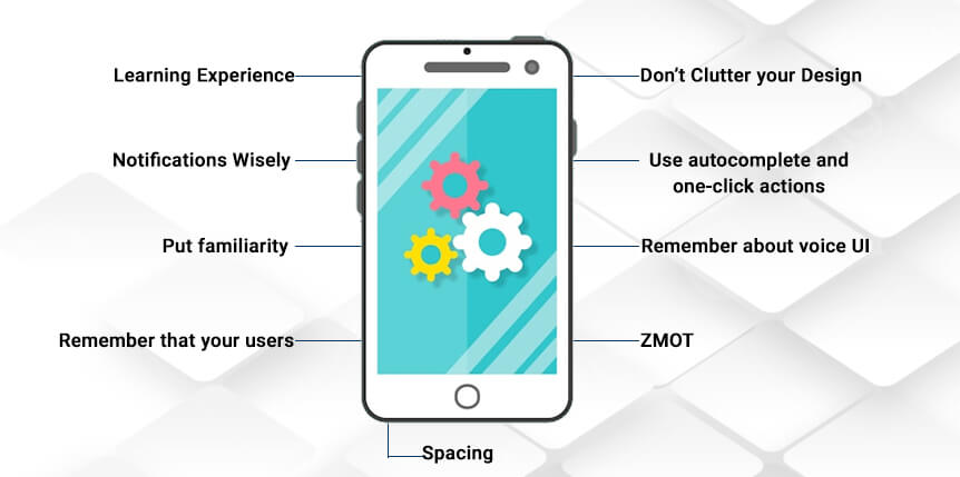
Here are Some Tips on How to Design the Best Mobile Apps
1. Create an Easy Learning Experience
Users like an experience that accomplishes what they need it to do, in the way they need it to do it, without requiring much thought on their part. Creating a simple learning environment is the technique to “teach” customers to use your website.
Consider it a video game. In Super Mario Bros., players are “taught” to accomplish their objectives by pressing A to jump. By leaping on an enemy, the threat is eliminated. Eliminating an adversary grants the player a coin (success!). By the time they confront the game’s final boss, players have mastered all the necessary game techniques for victory.
The Same may be Said of an App’s UX.
Users will be discouraged and frustrated by apps with steep learning curves. For this reason, you will need to employ minimalist app design ideas that keep everything extremely clean and uncluttered. Thus, making crucial functionality such as a search bar and a link to the homepage easily accessible and highly apparent.
You should not require users to navigate through several menu items to get these and other frequently performed actions. To decrease on-screen clutter, you can also integrate vital but less popular functionality within a collapsible menu.
2. Use Push Notifications Wisely
Push notifications may not be a fundamental component of your mobile app, but they play a significant role in the overall UX design of the app because they improve user engagement.
However, it is crucial to ensure that you are not constantly bombarding app users with push alerts. Deploy them just when they are pertinent and when users will find them useful. Uber, which pushes notifications to a user’s phone when they’re providing a special discount, typically on a specific day, is a wonderful example of this. Or Duolingo, which sends practice reminders to users who haven’t signed in for a specified number of days.
If you have access to the appropriate data, you might attempt the same thing – sending push alerts on days when customers are more likely to place an order, or while providing discounts on previously purchased items from the same range.
Provide app users with discretion over when and why they get push notifications, whenever possible.
3. Put Familiarity at the Center
Create a nice app based on what functions and what people are comfortable with. It’s natural to desire to build brand-new experiences that accomplish things in novel ways. But the truth is, when it comes to the greatest mobile app design concepts, it is frequently ideal to build on what has come before.
Users will not even need to consider how to utilize your application. They have performed this action on a thousand apps and websites. The challenge is to make it feel fresh, engaging, and consistent with the brand without disrupting the user’s experience.
Any eCommerce app will provide you with a similar experience to that offered by Amazon. The basket icon in the upper-right corner of the display. The product photos, followed by a product description, and finally the “Buy now” button. The reason for this is that Amazon has “taught” app users on how to purchase things. Therefore, it makes sense for others to follow Amazon’s example in order to enhance conversions and create a familiar experience for people around the world.
4. Remember that Your Users are on the Move
The design of mobile applications involves more than just creating experiences for the small screen. You are creating experiences that correspond to the user’s surroundings. You cannot fault (or prevent) users from using mobile devices while on the move, correct? However, it is possible to develop minimalist app experiences that “fit” into this portable landscape.
Certainly, they may be on your app. Then, a fashionable dress captures their attention in a store window. A friend has invited them over. This may cause the user to lose concentration. If you make it easy for people to resume where they left off, it does not have to interrupt the user flow. Consider how consumers are use your mobile application. Are they seeking countless hours of entertainment or a two-minute diversion between real-world tasks?
On the design side, keep in mind that mobile users will lack precise motor control, so avoid making buttons and actions finicky. Consider touch and gyro to aid in navigation. Consider what the user sees. Regardless of whether you’re designing a website or an app, designs should always be easy to comprehend at a glance. This becomes much more crucial for mobile users, whose heads move as they walk and who are easily distracted by their surroundings.
5. Don’t Clutter Your Design
Prioritize simplicity in mobile UX design. This is everything that users want from mobile applications. Consider the most downloaded applications in any app store.
To achieve this in your own app design, you must avoid clutter at all costs. It may frustrate and confuse users.
Let’s imagine you’ve developed a smart translation tool. There are numerous elements that could fit on the page. Dictionaries, “word of the day,” voice and text translation choices, a quiz… However, you must select what the primary action will be on each screen.
You will not be tempted to clutter the screen if you have a distinct focal point. Create this minimalist software with one-handed navigation in mind. Text fields and call-to-action buttons must be easy to view, read, and access with a single thumb.
Always keep visual hierarchy in mind. Utilize images, colors, typefaces, and sizes to bring users to the correct location. Instead of utilizing large amounts of text, convey information visually whenever possible; Google Calendar’s Schedule View is a wonderful example of this. UI design still places a premium on graphic design.
6. Use Autocomplete and One-Click Actions Where Possible
As part of your ‘simple’ design, consider other friction-reduction strategies.
The auto-completion of forms, auto-login, and one-click operations are useful examples, especially when establishing an eCommerce application.
Everyone is aware of how difficult it is to correctly enter an address on a smartphone device. Even if it is, they may need to look elsewhere (the contacts app, a wallet, or even a little black book) to ensure they have the correct information. Forms with autocomplete eliminate this field. As do short actions like ‘order again?’. Users conclude their journey with a single tap.
7. Remember About Voice UI
When designing an app with an emphasis on aesthetics, it is simple to develop around touch. The term ‘beauty’ is relative to the observer. Therefore, we consider the design’s visual elements first. We inquire “does it seem nice?” and “is it a minimalist app design?” and ponder what buttons a user must hit to accomplish their goals. However, do not disregard voice user interface.
Voice UI, which is available in every smart speaker and nearly every contemporary smartphone, enables your consumers to communicate verbally. In the coming years, VUI could become as significant as visual design.
There is no need to touch or even view the display. It quickly makes your software more accessible, expanding your user base to include those with mobility limitations (or just those who want to use your app while driving their car).
When it comes to the app development process, the design process for Voice UI might take some time to plan and implement. Such user interface design necessitates substantial ux research, testing, and prototyping. However, it is necessary if you wish to make your user interface design accessible.
8. ZMOT
The significance of content marketing is increasing as the Zero Moment of Truth (ZMOT) trend, a phrase created by Google in 2011, gains momentum. Google made a basic observation: when customers have a need, they search for information and make immediate purchasing decisions based on that knowledge. Google’s research indicates that 88% of U.S. consumers perform online research prior to making a purchase. Google asserts that the habit has gone global in recent years.
As a result of the elimination of the barrier “as soon as I return to my computer, I will check it out,” mobile devices have made the trend even more apparent. The usage of cellphones to make decisions increases the importance of clear message and information architecture. One-third of all Google searches for consumer packaged goods are performed on smartphones.
Be present in all popular searches relating to your product or service, keep an eye on your competition, and engage your audience with engaging content. Do not solely emphasize the benefits of your product. Explain the benefits of using the category of your product, and don’t be hesitant to compare it to the competition.
You need to make people feel comfortable once they find you when searching for an answer to their question. After explaining the advantages, the answer should include an effective CTA pointing directly to your solution. Testimonials and case studies can boost your message.
9. Spacing
The attractiveness and clarity of the message depend on the simplicity of the website design and the structure of the material; hence, every UX design agency recommends a minimalistic approach. Avoiding superfluous visual distractions ought to result in a more effective call to action.
Aesthetic-Usability Effect
Every UX designer should be aware of the aesthetic-usability effect, which is a commonly observed phenomena indicating that users tend to erroneously associate the surface appearance of websites with their practical functionality. This propensity could be advantageous for UX design, but it could also be a double-edged sword, and it should not supplant the importance of practicality.
The Gestalt Law of Proximity
There is an important rule to bear in mind regarding spacing. The grouping principle, often known as the Gestalt law of closeness, was developed by the Berlin School of experimental psychology. It’s fairly simple: if you position objects reasonably close together, our minds will perceive them as a group.
This is the predominant trend. The Gestalt law applies to things of various shapes, sizes, and colors; if they are near together, the brain considers them to be a group.
Conclusion
Users are the most critical factor to consider. They are the ones downloading your software and returning daily. Designers and developers cannot afford to design unsatisfying user experiences in the competitive digital arena. The type that overwhelms or confuses users, compelling them to click “Uninstall” faster than The Flash can sprint.
Good UX design for mobile apps has conditioned all of us to expect the app to meet our needs, not the other way around. User-centric designs must be intuitive and straightforward to use. As normal as receiving mail or closing a door. But infinitely more enjoyable for them.
Our UX experts can help you in numerous ways to enhance the user experience, but in order to begin, you must determine which areas to priorities. Some improvements need a great deal of time and resources, but with the correct research and funding, they will eventually bear fruit. Your users will appreciate it afterwards! Contact us to know more details.